
Modernising medical society branding for a stronger identity
Our client challenged us to develop a distinctive new brand identity to promote and showcase the ESOT Annual Congress.
Client: European Society for Organ Transplantation (ESOT)

Embedded the refreshed branding across all society activities, including events and congresses, publications and committees

Delivered a professional, contemporary brand with consistent visual identity, including for the bi-annual congress

Provided clear brand guidelines and templates to support seamless use by designers, managers and stakeholders
Our approach
Beyond conducted a strategic audit of ESOT's branding over the previous decade to review its evolution and identify opportunities to strengthen consistency across its communications.
We then developed a comprehensive society-wide rebrand, bringing all ESOT communications and promotional activity under one cohesive umbrella identity. This created a clearer, more consistent visual and strategic presence across the organisation.
The refreshed identity modernised ESOT's image while preserving the society's heritage, prestige and core values.
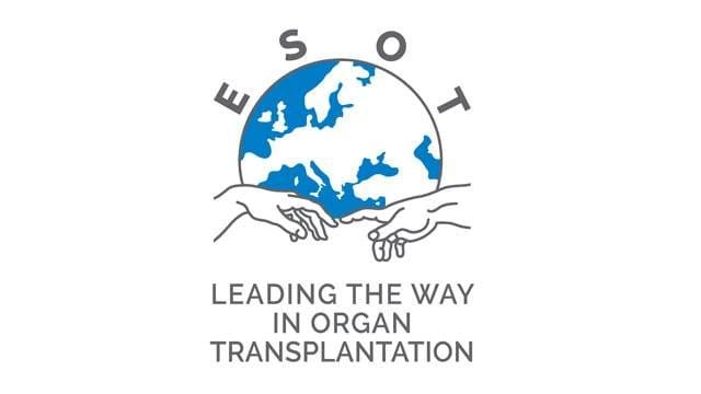
Previous ESOT logo
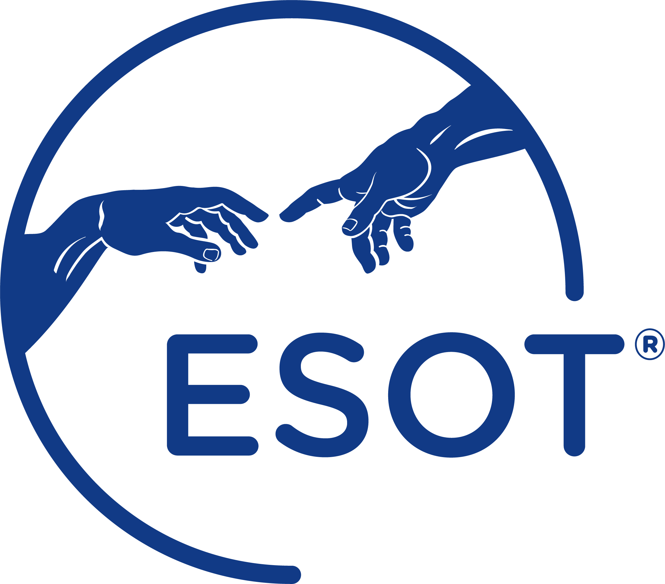
New ESOT logo

Outcomes
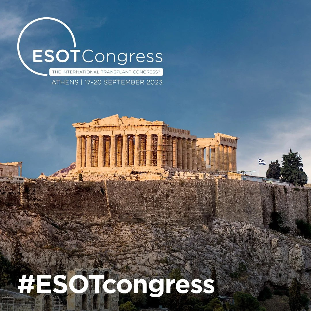
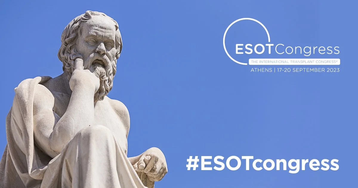
The rebrand established a cohesive visual framework that was rolled out across ESOT's key platforms, events and communications. This included the refinement of the ESOT master brand and the branding for the ESOT Congress from 2023 onwards.
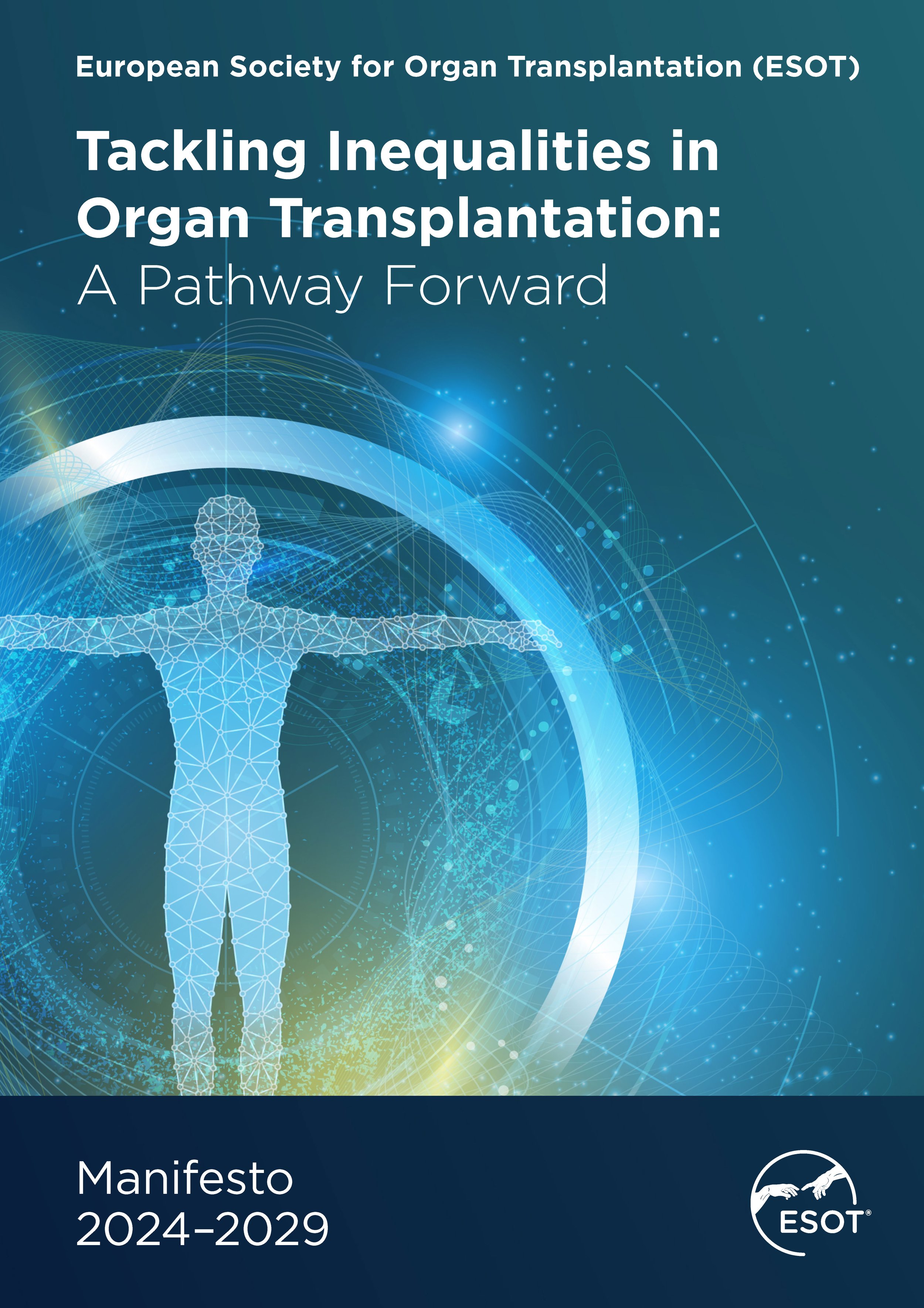
The new approach also unified branding across ESOT's Sections and Committees, introduced distinctive hero imagery and created a consistent visual identity for the society's flagship journal, Transplant International.
Together, these elements created a modern, recognisable brand system that strengthened consistency across the organisation and enables the brand to evolve as ESOT continue to grow.
Really great work, thank you all!
ESOT CEO